
Overview
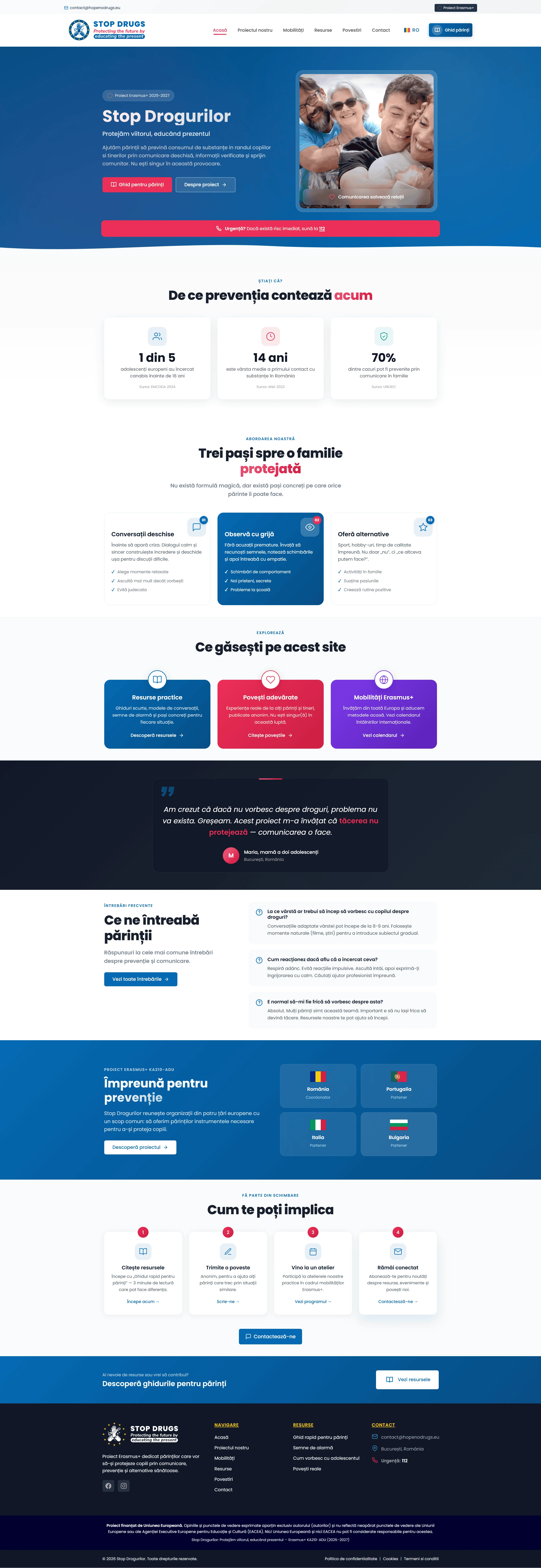
Hope No Drugs is the public-facing platform for an Erasmus+ KA210-ADU project running from 2025 to 2027 across four EU countries (Romania as coordinator, with Portugal, Italy and Bulgaria). The project gives parents of 8–18-year-olds practical resources and conversation prompts for drug-use prevention, in clear language suited to families and without standing in for medical, psychological or educational support. The tagline says it directly: "Protejăm viitorul, educând prezentul" ("Protecting the future by educating the present"). We built the platform from scratch as a custom-coded build, with five languages, accessibility treated as a requirement from the outset, and the technical and communication requirements agreed for a co-funded project.
The Challenge
EU-funded prevention programmes have a specific problem: they need to communicate with real families while also meeting the visibility obligations that come with Erasmus+ funding. The copy has to be warm and practical, because the project documentation is far too dense for quick reading on a family-facing site. The structure has to be transparent, presenting the project, its partners, its activities and its public outputs clearly. Accessibility has to be treated as a core requirement rather than a finishing touch. And all of it has to work across four partner countries and five languages, without losing coherence as you switch from Romanian to Italian to Bulgarian.
The second requirement was the visual direction. Institutional identity and Erasmus+ visibility had to stay in place, without dominating the resources meant for parents. We wanted the site to read first as a resource for families.
The Approach
We built the platform on the same in-house tangled-design architecture we adapt for projects with comparable requirements around maintenance, performance and accessibility — the same codebase that powers Uroclinic Craiova and the DGAUIS public sector platform. This isn't accidental. A mature in-house foundation means:
- Accessibility proven across real projects, with WCAG 2.2 AA as the working benchmark
- Performance measured before launch, with fewer optimisations needed afterwards
- Straightforward administration (content editors maintain the platform without us)
- Familiar structure across projects
Multilingual access wasn't left to the end. Language selection is a primary navigation element, visible on every page, and the four partner-country languages plus English are treated equally.
The Solution
- Custom-coded platform (built on our in-house
tangled-designarchitecture) - Five-language switcher covering Romanian, English, Italian, Portuguese and Bulgarian, via GTranslate with
hreflangtagging configured - Three-step prevention methodology as a purpose-built numbered-card component:
- Conversații deschise (Open conversations) — how to talk to your child without them shutting down
- Observă (Observe) — which warning signs actually matter
- Oferă alternative (Offer alternatives) — what to do instead of only saying no
- "Știați că?" statistics block with three figures on adolescent drug use, drawn from the project's own materials
- Expandable frequently asked questions covering the themes parents raise most often
- Contact form with hCaptcha, avoiding a Google reCAPTCHA integration
- Four partner country showcase with flag icons and partner organisation details
- "Cum te poți implica" (How to get involved) — four-step engagement flow
- Povestiri (Stories) section — anonymised accounts, published in the form set by the project partners
- Mobility calendar — upcoming Erasmus+ mobility activities
- Animated counters (
counters.js) for the project's public indicators - Fixed secondary call to action ("Ghid pentru părinți" — Parent Guide) visible on every page
- Emergency "112" tel: links accessible from any page
- Self-hosted Poppins typeface (WOFF2, subset to the characters in use)
- Fluid
clamp()typography - Skip links, ARIA labels, semantic HTML throughout, with manual accessibility checks before launch
- Erasmus+ funding disclosure prominently shown
Key Moments
The three-step methodology as a component
The project documents describe the prevention methodology in dense academic prose, which is hard going on a site aimed at families. We turned it into three numbered cards with icons, short plain-language titles and two-sentence summaries. The information the project requires is all still there, simply reorganised into a format that can be read quickly. The specialist content itself was supplied and approved by the project partners.
Five languages, consistently maintained
Multilingual is easy to get wrong. Here, the four partner-country languages plus English hold the same status: the language switcher is visible on every page rather than buried in the footer, and the multilingual structure is configured so that each version can be reviewed and updated over the life of the project. The content comes from the partner organisations in each country.
hCaptcha instead of reCAPTCHA
We chose hCaptcha for the contact form so that we wouldn't add Google reCAPTCHA and to reduce the form's reliance on Google services. hCaptcha is still a third-party provider that processes data, and it needs to be described as such in the site's privacy and cookie information. For a platform aimed at families, it felt like the right call.
Accessibility from the start
The site is fully keyboard-navigable, meets contrast requirements, and scales its text without anything breaking. We tested it manually with a screen reader, then on a keyboard-only session, then at 200% zoom, and fixed what those runs turned up before launch. WCAG 2.2 AA was the working benchmark throughout implementation. With a public sector coordinator and a broad audience, accessibility was treated as a core project requirement rather than a finishing touch.
The Stack
Custom-coded platform (tangled-design in-house architecture)
Self-hosted Poppins (WOFF2, subsetted)
Custom CSS files: header, hero, global, patterns
Deferred JS strategy
Purpose-built counters.js and schema.js
Five-language multilingual configuration · hCaptcha
Schema.org (Organization)
WCAG 2.2 AA as the accessibility benchmark
Speculation Rules API for prefetching
The Result
A live, multilingual prevention platform for parents in the four partner countries, in five languages. Launched in time for the Erasmus+ project's opening meeting. Core Web Vitals were measured within the recommended thresholds at launch, and accessibility was tested manually before publication.
The structure brings the project overview, partners, parent resources, stories and activities together in one place, and content supplied by the partner organisations is added through structured fields as the project continues to 2027.